Monday, April 26, 2010
your humble featured photographer
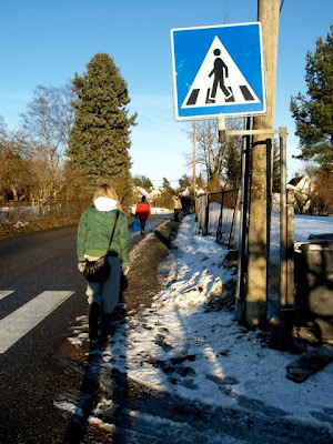
yes indeed, this one was chosen for the official olympus user photo gallery. www.olympusamerica.com/cpg_section/oima_gallery_form.asp i stumbled across this one by accident! can you believe it? this area borders the city-hard to believe, sure looks like i'm in the boonies. this is typical nebraska though. corn fields on one side of the street and apartment complexes on the other. i drive here quite a bit blasting coldplay just to my creative juices flowing. it works every time. thank you Olympus for considering this image. i do believe it is quite original and the comp isn't too shabby either.
Sunday, April 25, 2010
copenhagen
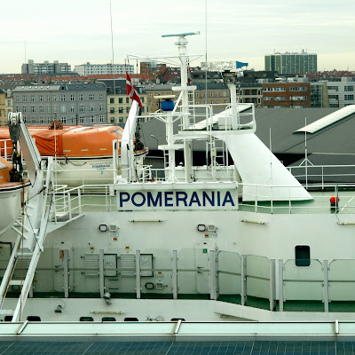
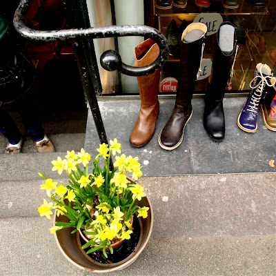
i like random mysterious subjects, abstract and pretty things so these are what i discovered in copenhagen. it's beautiful city and there are plenty of subjects to photograph. the 2 drink images are shot on the boat to denmark. i love the reflections of the sunset and ocean in the bottle and then the bubbly liquid colors from the "disco" lights!
Saturday, April 24, 2010
crow door denmark
here is a good example of what i am trying to achieve in the lengthy world of post processing. keep in mind most of my editing is done in iphoto. which is not the most pro software in the world but the results can be great if you are careful not to over do it. i am striving to master as little as possible such as levels and exposure and sharpening. this can be time consuming and i am almost able to automate soon. i also hear ps elements can do a mighty fine job too. i do own cs3 on a pc but who in their right mind would ever get anything done properly on a pc? so i avoid that area like the plague. pse8 will be my next purchase. extremely affordable and gets the job done. in these images i like how you create the creamy dreamy wow affect. i think it's pretty darn close. iso 200, f4,1/80. from flat to PHAT! i'm quite satisfied with the results!
Friday, April 23, 2010
ikea fun part 2
this place is amazing. except at this location in oslo norway it is cramped and you feel as if you are corralled and rushed into a hamster maze. we wormed our way through the place by following the magic arrows. documenting this place was quite stressful. and it was a monday night?! leia had fun though. so did gagamomo. the most disappointing part in the end was the meal. i was looking forward to a tasty salmon and treats but instead it just plain sucked. moms home cooked meals win every time. iso 800 for poor nasty suck fluorescent lighting. which always means noise. these were edited a bit for that and exposure. had i had a tripod and no chaos, things would be different. f2.8 and 1/60. i did the best i could under such suck circumstances. i still love ikea.
Thursday, April 22, 2010
bff's
these gurly wurlys have been bff's since kindigarten 1999. here they are 11 years later and the friendship is still strong. can't you see it in their expressions? this you can't fake. iso 200, f2.8 1/160. i probably ought to have set it to iso 400 and 1/250 or 1/320. teenage gal pals are always fidgety and on the move! they're similar to pets in that they rarely are still. i shall have to keep this in mind.
Saturday, April 17, 2010
norwegian walk
an evening stroll after a traditional norsk fisk meal. the temps were quite chilly. keep in mind this was mid march in oslo and the weather is unpredictable. mom, leia and i wormed our way through hoybraten and discovered some interesting sites. not much has changed since i was last here. although it seems quieter. iso400 for the most part. sun was setting and app set to 2.8 for max light. the porcupine family is iso100,f2.8 1/160. i think it's acceptable to blur the foreground baby and focus on the middle child(or second). maybe my subconscious was thinking me the whole time. it's never about me! except, everything i shoot is sort of my autobiography. my journals.
Tuesday, April 13, 2010
greenhouse luvrs dream
there are many nurseries out there that are quite nice but this particular one i paid a visit to just north of the city of oslo is mighty fine. this was an ikea format of a greenhouse. neat and tidy and orderly and bold and graphic and simple and clean and practical in design. even a modern cafe in the center of the greenhouse with tasty treats for my tummy. knowing you have somewhat of a green thumb is a good thing. 14-54mm, iso100-200, f2.8 settings for wonderfully diffused lighting. love it.
Sunday, April 11, 2010
day one on norway vaca!
Subscribe to:
Posts (Atom)